The Science Behind Color
Have you ever wondered why the colors on your computer screen look a little different when they’re printed out? Or that your company logo’s colors look brighter or darker on your website compared to your business card? Here’s a hint: it has to do with the science behind the way colors are formed and how our eyes process them.
Color influences almost everything around us. From annual report designs to logo concepts to social media graphics, our creatives frequently turn to color in design to convey emotion, hierarchy and emphasis. As fun and organic as colors are, it’s important to remember that their existence is actually rooted in science. All the colors that we see represent our perception of lightwaves when they are reflected off an object. These lightwaves range from short to long, and as a whole make up what we know as the visible spectrum of light. Using this science, the phenomenon of color printing came to fruition in the late 1800s. Later in the late 1960s, color television made its debut, forever altering the way we understood and interpreted color. While modern day technology has rapidly enhanced the quality and crispness of colors we see on screens, the science behind color theory has remained relatively unchanged.
RGB
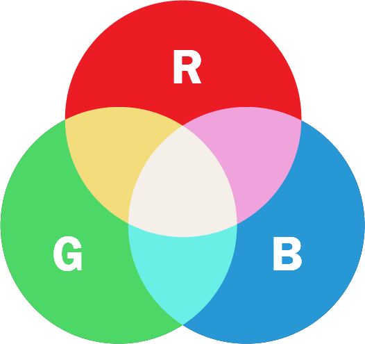
RGB stands for Red, Green, Blue. This color mode is used for digital screens like your desktop computer, tablet, cell phone, television or projector. We can see these colors because of projected light. Any images or graphics that you want to load into your website or social media will need to be in RGB color mode for optimal display. Common file types that you would provide to a design team in RGB color mode are photos or graphics with the extension JPG or PNG.
CMYK
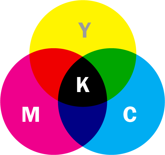
CMYK stands for Cyan, Magenta, Yellow, Black. This color mode is used for all printed files like business cards, flyers, brochures, postcards and banners. We can see these colors because of ink dots that combine to make other colors. When you provide files to your designer for a print project, they will likely convert the files to CMYK for optimal color consistency. If not, the print vendor will convert the files to CMYK before being able to print.
Pantone
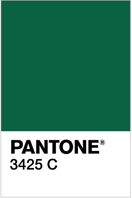
Pantone (Pantone Matching System or PMS) is a color system used in a variety of industries, primarily printing, to enable exact matching of color for branding across all forms of marketing materials. Pantone colors are exact chemical mixtures of color and most large brands have and use a Pantone color in all of their materials including paint, fabric, and plastics. For example, the Pantone color for Starbucks (one of our favorite coffee brands!) is PMS 3425.
From printing and ink innovations to clearer, brighter electronic displays, advances in color usage for both print and web emerge all the time. While color is only one facet of design, it’s an important one to master in order to correctly apply it to a concept and achieve a visual design goal. At Red Orange, we know the value of studying the intersection of color and technology so that we can create the most effective visual solutions for our clients. Need proof? Check out our portfolio to see how we apply the power of color to give our solutions that extra oomph.