Blue Ridge Area Food Bank
Founded in 1981, Blue Ridge Area Food Bank (BRAFB) has been providing relief for people in need across central and western Virginia for over 30 years. As food banking has evolved over the decades, Blue Ridge strategic work revealed the need to evolve their own branding to properly reflect and speak about their current services and offerings more effectively to their audiences. BRAFB then approached Red Orange to update their visual brand to better represent their role as the leader in hunger relief and better exemplify their core brand personality– humble, strategic, hopeful, and practical.
Creative Services
Logo Design
Brand Guidelines
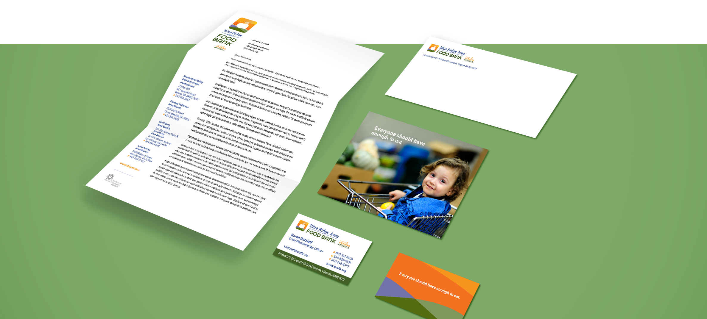
Print Design
Signage
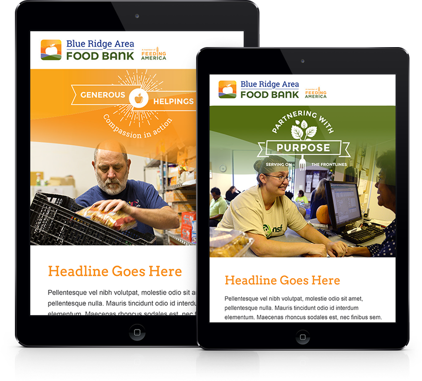
Email Newsletter Templates
Collaborative Approach
Red Orange and BRAFB worked together to identify the main objective of the rebrand: create a logo and brand that would embody the impact the food bank brings to the lives of the people it serves while simultaneously appealing to current and future donors. To ensure the best results, we scheduled regular touchpoints to listen closely to BRAFB needs and guide them through our strategic recommendations. Our growth together as brand partners led Red Orange to help BRAFB follow through with their brand transition, as we assisted in presenting the new concepts to their Board of Directors.
Solution
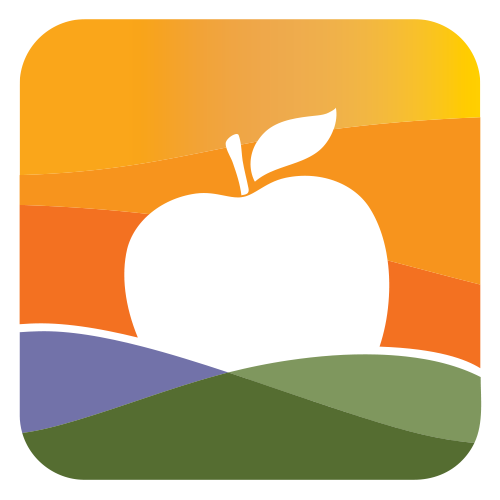
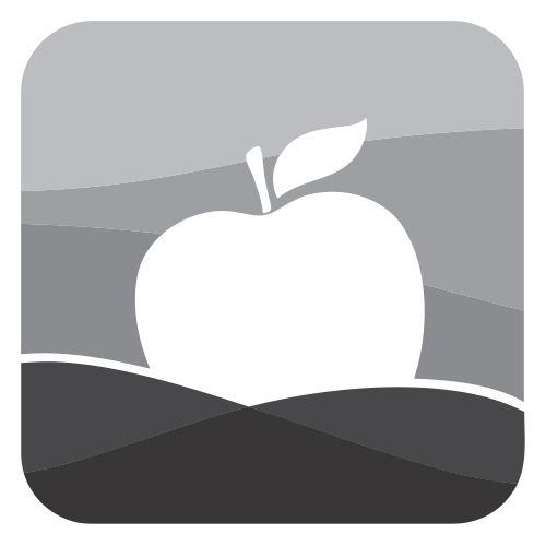
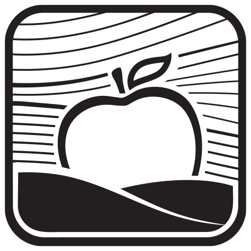
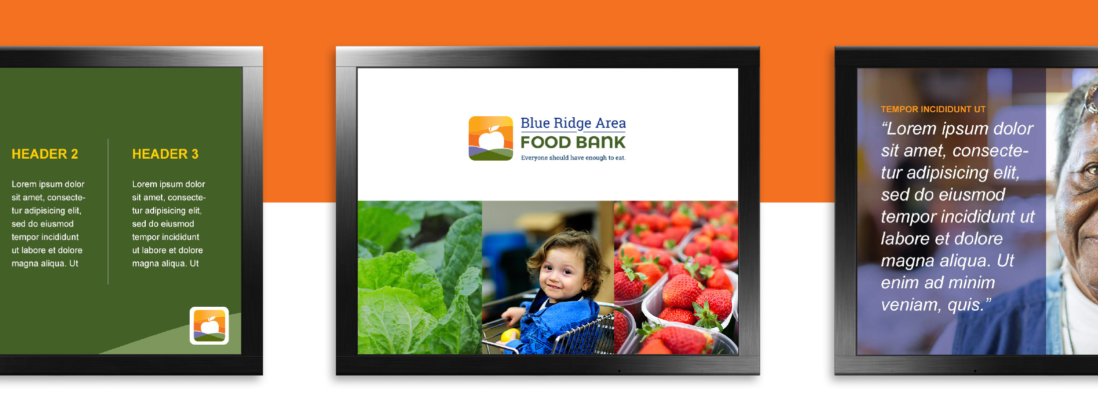
The visual direction in the logo refers to the impact the Blue Ridge Area Food Bank makes in the lives of the people they serve. The elements come together to create a sunrise, symbolizing a bright future, warmth, and hope. The use of the apple to represent the sun makes the clear connection between hope and food. From this point, Red Orange worked collaboratively with BRAFB to develop their extended brand style guide and provided them several more technical solutions: a PowerPoint presentation, a newsletter template, a stationary package and outdoor signage.
Outcome
With the fruition of their newly refreshed brand, BRAFB leadership felt more secure in their ability to accomplish their goals and reach their intended audiences. All Blue Ridge communications were now given guidelines for consistency, both visually and in their messaging. Confident in their brand partnership with Red Orange, BRAFB was eager to see the positive effects of their new branding and keep the upward momentum going.