GoRelo
GoRelo is a boutique-style relocation management company that specializes in auxiliary services for businesses looking to seamlessly relocate their employees to new locations. The company’s team of experienced consultants offers its clients a completely unique relocation experience with a customer-centric approach and flexible, cost-effective programs that are customized to fit each clients’ specific needs. Before fully launching, however, the company needed guidance on how to define and differentiate itself from its parent company with a completely new brand identity. GoRelo came to Red Orange for the task, and requested we join the effort to develop the company’s name, visual identity, and brand strategy.
Creative Services
Naming
Logo Design
Print Design
Brand Development
Collaborative Approach
GoRelo was born out of a need to distinguish itself as a separate division with its own identity. The Red Orange team began our collaboration with the GoRelo team through a series of investigative conversations and interviews to land on a unique company name that could stand out from the competition. It took a list of key stakeholder interviews and a thorough competitive analysis to gather insights around the brand and its services, and to fully understand the customer experience. From these interviews, Red Orange was also able to create model audience personas for GoRelo’s target customer base and internal company values.
“As always, we appreciate and value the insights and recommendations RedOrange brings to our business. Their recommendation for our GoRelo rebrand was rooted in strategy, and the end result is something we continue to be very excited about to this day. The name, values, and iconography perfectly speak to the idea of ‘moving forward’ which is what GoRelo is all about. Thanks for the collaborative effort, Red Orange team!”
Solution
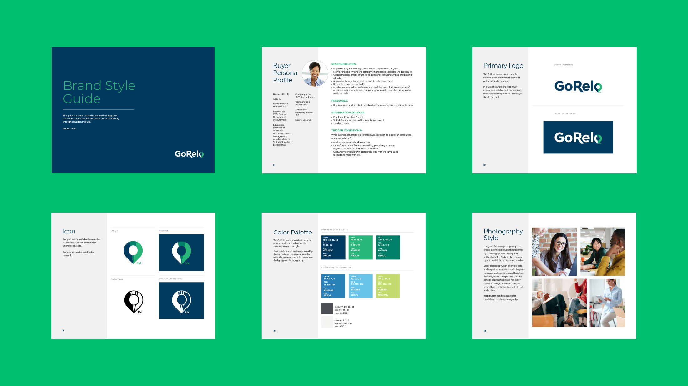
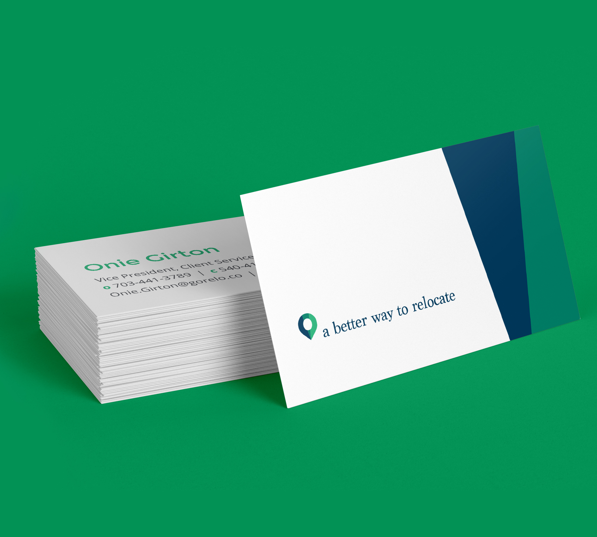
After many rounds of concepts and revisions, The Red Orange team finalized and established GoRelo’s visual identity as an independent and free-standing brand, separate from its parent company. Drawing inspiration from the word “Go,” we developed a logo mark and integrated a GPS coordinate marker into the text that featured each of the company’s new brand colors, immediately hinting at the services they offer. We then carried those design elements into their print materials and developed a comprehensible brand style guide to advise any future marketing collateral.
Outcome
Just as the GoRelo team offers “a better way to relocate,” they left with a better way to communicate who they are and what they do. Their fresh brand identity now reflected not only the company’s services and values, but also the team’s personalized, human-centric, relational and confident approach to business. While only at the dawn of their journey in the auxiliary marketplace, GoRelo’s new lineup of strategic marketing tools has gotten it that much closer to achieving its goal of redefining today’s relocation solutions for tomorrow’s success.


